Using Visual Models to Spark Mathematical Discussion

Pop culture makes great fodder for engaging math problems. The other day, while working on finding fractional parts of whole numbers, I introduced the following problem:
“648 people saw the new Jumanji remake. ⅜ (“three-eighths”) of the audience were men. ¼ (“one-fourth”) of the audience were children. How many were women?”
When I reviewed their work, I noticed that only about half of my students got it completely correct. Of all my students, only one chose to draw a picture of their solution strategy. All students at least discovered that half of 648 is 324, but they clearly were lacking a visual context for making sense of the problem.
I decided to build several visual representations of the problem in the Math Learning Center Apps, and then compile them into a Google Slides presentation. The next day, I showed the Slides to the the class hoping to invoke discussion about the possibilities of visual models.
First, I introduced a set of “rules,” which mandated a 30-second consideration silence as students encountered image. I then asked students if they remembered the problem from yesterday, so I could write it on the board next to the projector. To my surprise, the whole class correctly constructed the problem, with the correct numbers and fractions. This galvanized them, and they were squirming to see the models. I said that one of them was drawn by me, and the others by my friends. This ensured that they gave all of them a “shot” so as not to hurt my feelings. I began with this one using Number Frames , because I knew the penguins would get their attention.
Image Description: In a two-by-four grid, there are eight penguins, three red, two blue, and three yellow. An equation off to the side states that 681 divided by 8 is 81. Three lines are drawn to each of the three yellow penguins. A second equation says that 81 multiplied by 3 is 243.
After about eight seconds of silence, I heard students start those “I-am-dying-to-tell-you-what-I-think” sounds while raising their hands. After 30 mostly silent seconds—whereupon more deliberative students could make sense of what they were seeing—I called upon one of my quieter students.
She said, “I like how they color-coded it.”
I asked her to tell me more about that, and she revealed: “I like that they could see that the three red penguins are the same as the three yellow penguins, so once you find one, you found the other.”
Then I asked, “How did they know how many penguins to have in the first place?”
I called on a different student, who said, “Well, each penguin represents an eighth. So, they first gave themselves a ‘house’ with 8 rooms.”
When I asked them to rate this model, everyone was in the upper range: 3’s, 4’s, with very few 0’s. When I asked certain students why they rated it this way, one said, “I wouldn’t have ever done it like that, and I think it’s cool.” Another said, “It’s a simple way of illustrating a hard problem.” I moved on to the next model, this time created in the Fractions Web App:
Image Description: Three rectangular bars are stacked on top of each other, all the same length. The top and bottom bars are divided into eigth sections, while the middle bar is divided into four sections. In the top bar, the first three of eight sections are colored in orange. In the middle bar, the last of four sections is colored in blue. In the bottom bar, the fourth, fifth, and sixth sections are colored in yellow. Between the three bars, the length of entire bar is accounted for with either orange, blue, or yellow.
Students took a bit longer with this one. Some recoiled at first, because we had graduated from penguins to “boring rectangles,” but as soon as one student exclaimed, “Oh!” and shot a hand into the air, others gave it a little more creedence. I began my discussion by asking, “Does anyone want to guess what I really love about this one?”
One student suggested, “It shows that ¼ is equal to 2/8.” I asked him to come to the screen to point out what he meant, and he pointed to the blue portion of the bar.
As I asked students to raise their ratings in the air, I noticed one student flickering a 1 and a 5. I asked why she felt this way, and she said, “Well, I like the model, but it feels incomplete. All we know is that one whole is 648, and that there are eighths. What are those eighths? What is the fourth?” Other students listened intently to her, and some said, “You’re right, that’s driving me crazy! I want to keep going with it!”
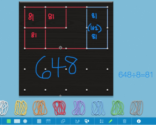
We moved on to visual number three, whereupon one of my more distractible students shouted, “ Geoboard !” Well, now I know what gets him excited!
Image Description: This is a digital model of a physical Geoboard. A Geoboard is a flat piece of material with pegs at evenly spaced intervals, and students can use rubber bands to loop around the pegs to create shapes. On this digital Geoboard, there is a rubber band rectangle that takes up the space of eight squares. On the left side of the rectangle, there are red rubber bands around the perimeter of three squares. On the right side of the rectangle, there is one single blue rubber band around two squares, marking off a sort of column. There are three empty squares remaining inside the rectangle, without rubber bands.
Students took in what they were seeing, and that student, who typically has to be coerced into discussion, was flailing with excitement to volunteer. After 30 seconds, he came to the front and described the image: “They knew they needed eight squares to symbolize eighths, which they did with the red squares. They also saw that they could draw four blue ‘columns,’ representing fourths. Then, you can see that two eighths—one fourth—is 162. You can see the empty part, symbolizing the women. And it’s easy to see that it’s the same shape as the three red squares, so they have the same value.”
After more discussion, we rated this one, and there was no spectrum: students either loved this or they hated it. I found this compelling because students whom I would normally group together—by ability level, temperament, working styles, complementary personalities—would often differ wildly in their preferences for visual models. Imagine if I had assumed that one model would suit my three top performers? I would be wrong; it may be that my top performer and my lowest student were in absolute agreement. This moment in class created alliances between students who previously felt nothing mathematically in common.
In the past three classes since this discussion, I’ve seen my students not only use more visual modeling in their work, but take pride in both the variations they can make (“I did it a slightly different way”) and by evaluating and giving helpful critique to their peers (“I like how you did this, but this other part totally broke my brain!”). I only wish I’d done this sooner, but hey, I’m learning too!