Accessibility, UDL, and an Eye on Design

AIGA Eye on Design publishes a wide variety of articles on design. As a designer, I find it a highly inspirational, rich resource for flipping world views, and facing controversy head-on. Its most recent article on Cooper Hewitt’s new exhibit, Margaret Andersen’s “Access + Ability: Why Accessible Design Isn’t a Niche Market ” caught my eye.
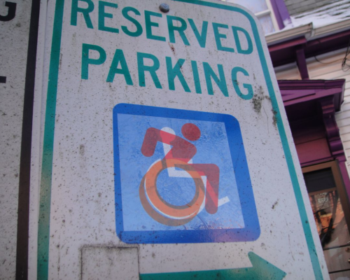
Accessibility is a hot topic but a challenge to apply to my everyday work. Some of the examples provided were awesome sweeping changes like a redesign of Susanne Koefoed's International Symbol of Access, which is part of the Department of Transportation’s fifty standard pictograms displaying a person in a wheelchair. The old pictogram was very, clean and useful but static and utilitarian. The new design adds energy, movement and suggests more independence with simple adjustments of angles and alignment the individual forms. I dream to work on projects that have a positive impact on the world we live in. But, I’ve recently been meditating on the smaller, everyday adjustments that can make huge positive differences.
In the classroom, this movement is called “Universal Design for Learning”—“UDL” for short—and we see the same tenets from UX to print design and everywhere in between. Case in point, the article poses the question: What can designing for accessibility teach us about designing universally ? It reminds us that design is at its origin fundamentally assistive . Yet, why are most accessibility products purely utilitarian without the consideration of form? Andersen writes, " When it comes to products that assist people with disabilities, however, design choice and aesthetics tend to take a backseat to utility. These products are often purely function, designed through a medicalized lens that reinforces the social stigma associated with assistive devices. ” Why does a powerful communication tool like visual (or non-visual) design so often become a secondary—or worse, an afterthought?
Design solutions for increasing accessibility are as diverse as the audience we are assisting. It relates to navigating a physical space, offering multilingual options, audio assistance, larger printed materials, a clear description of what someone might find at a bus stop in order to navigate their wheelchair, and much more. Icons are some of the most universal tools used world-wide to help break through exclusive boundaries. I would love to learn French, but how great is it that the Paris Metro train has a color-coded diagram with icons to help me find my way to the Louvre on my own?
Fortunately, there is a current technology push to be more accessible. As we move forward, we should ask ourselves: How can we be smarter about how we build buildings, vehicles, clothing, websites or apps? Is our work inclusive of all people or a select few?
- Websites: If we write clearer descriptions and use simple consistent tags search engines will be able to find needed information more easily.
- Digital and print media: Take a harder look at the color palette for contrast, and don’t rely on color alone to convey content. Keep in mind that a really wide line of text is hard to track, and plan for mobile UI to include large enough buttons for touch. Is your fingertip larger than ¼”? A recommended button size for mobile averages 40 pixels, or more inclusively, 2.5em (1”=72 pixels).
What other small adjustments can we layer into our daily projects that we may assume are not barriers? Our goal should always be to change the nature of access to improve communication, because as UDL states, what is designed for the margins is usually best for the whole. Check out the infographic below for best practices of Web Accessibility for Designers, according to webaim.org :

I’ll leave you with this powerful quote from Andersen, as I continue to think on this and reframe the lens through which I design:
"The evolving International Symbol of Access and the breadth of designs featured in Access + Ability demonstrate that accessible design is anything but a niche market. One in five people currently experiences some form of disability, and as our population ages, the need to create more accessible products, services, and information will only increase. But the real achievement of the exhibition is not just that it promotes more consumer choice for individuals with disabilities. Rather, it uses design to dismantle the medicalized view of disabled and non-normative bodies and reminds us that disability is a diverse yet universal experience that is part of the human condition" (Andersen, 2018).